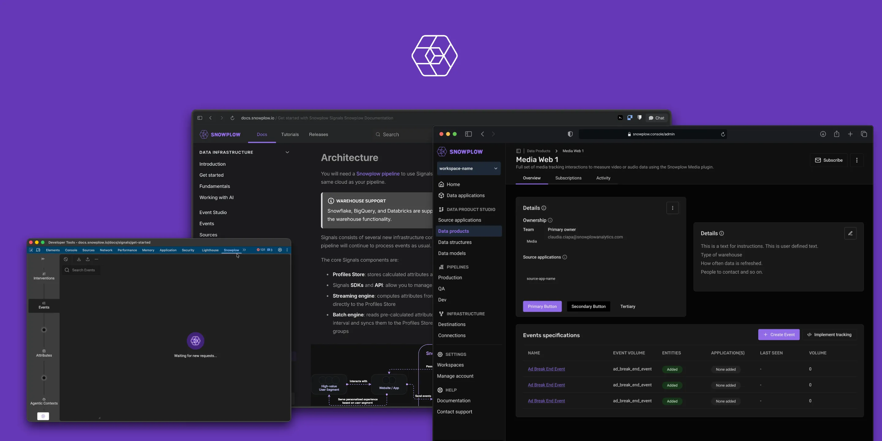

Before I arrived, Snowplow’s product had quietly split into three. The platform Console, the documentation site, and the Inspector extension had each grown their own patterns — three different card styles in the docs alone, styling conventions no one still agreed on, a debugging UI a release behind the product it was built to inspect. AI tools had made a v0 of anything trivial to spin up, and everyone did; but each prototype invented its own tokens and spacing, so it looked wrong the moment it touched production and an engineer rebuilt it by hand. Nobody had filed a ticket about any of it. It wasn’t heading for a crisis — it was just three products wearing one logo, drifting a little further apart every sprint, at growing scale.
We should not have 3 different card styles across docs.
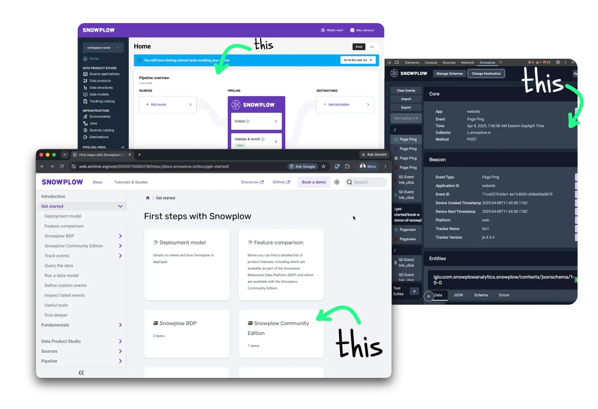
That’s the gap Snowplow hired me to close. I came in as a contract design engineer — with a line that was equal parts compliment and trap, you do this with your eyes closed — to make those three surfaces feel like one product. I built the foundation — a shared design system, Avalanche — and worked inside the codebase rather than handing off specs, opening PRs alongside the team. But the leverage was never in shipping every fix myself. It was in consulting and aligning the designers and engineers around one contract, so they refined the system with every commit and every design — and it kept getting better without me in the room. Today they run it without me at all. That’s the forward deployed job: embed with the teams, map how they actually work, deploy on top of their stack, and leave behind a system they own.
Inconsistency is a tax: every new surface re-litigates decisions that should already be settled.
The Console internals are Snowplow’s, so everything shown here is already public — the theme, the docs site, the Inspector extension — plus diagrams and a redacted excerpt. I’d rather show you the structure than a blurred screenshot.
The through-line
Snowplow isn’t an analytics dashboard. It’s customer data infrastructure: it collects, structures, and enriches behavioral data, then delivers it into the customer’s own warehouse for their data teams to model. It’s the pipeline, not the chart — which makes the product surface dense enterprise tooling with a low tolerance for decoration and a high tolerance for tables.
For a data platform, the docs and tooling are the product experience for most developers — so the drift up top wasn’t cosmetic. It was the product fragmenting in plain sight, one surface at a time.
The fix wasn’t a redesign of any single screen. It was shared foundations — and the way I work: design engineer, not designer-then-handoff. I stayed close to the code, in the repos (Docusaurus for docs, a React/Tailwind front end, a Preact extension), opening PRs and handling the real-world constraints that only show up there. But the goal was never to be the one who ships everything — it was to set decisions the team would carry, refine, and improve on their own.
The foundation: Avalanche
The system is the argument; the surfaces are the evidence. Avalanche carries one idea from my prior work — a closed world the tooling can’t drift outside of — into a second organization. Here’s the precise cut, rather than a flattering one:
| Carried over unchanged | The closed-world philosophy. Tokens as the contract. An enumerated set of atoms. shadcn primitives as the floor. |
| Didn't transfer | The prior variable system — built for a different audience on a different stack. I moved the team off it entirely, onto shadcn's own theming model. |
| Had to be invented | A source of truth neither Figma nor the repo owned. shadcn had no theming mechanism yet, so the variables live in a third place both teams can reach. |
That third place is a public tweakcn theme. One URL — designers open it, engineers open it, and it’s the same object. It’s the reason the same system reaches three surfaces without a shared codebase between them. The lesson generalizes past the tool: when design and code have no common home, don’t pick one team’s home — find a neutral one and make it boring to reach.
One token layer. Every surface. Avalanche is a set of semantic tokens on a shadcn base — one source of truth that Figma and code both read. Components reference roles, not hex, so a theme swaps its variables and the markup never moves. Toggle it, or edit a swatch, below.
Real-time attributes computed from the stream.
Every control here changes a variable, not the markup.
The obstacle was investment, not taste. Seven engineers had spent years building an MUI system. It worked; they were right to defend it. I didn’t win the argument by being right about shadcn — I won it by not asking for a rewrite. The two systems coexist: anything new is built in shadcn, and we rebuilt some larger organisms in it too, deliberately identical to the MUI versions so nobody could tell from the outside. I called it 1% better, a two-year migration. The concession is real; the alternative wasn’t a fast migration, it was no migration.
The CPO went first — by accident. The team had tried v0 before me and bounced off it: the output didn’t look like their product, because nothing had told it what their product looked like. I put the tweakcn variables into the project rules — a constraint the tool had to obey, not a suggestion it could drift from. Same tool, same people, and suddenly the output looked like Snowplow. The CPO’s own prototypes started looking real enough to take to the CEO. That’s the adoption mechanic I’d repeat: don’t sell the system to the team that has to maintain it — give it to the person whose demos matter most, and let the system make them look good.
Adding Alejandro who is making some PRs and doing some additional design work — adding in the Avalanche system variables today. — John Reid · #inspector-team
The handoff stopped being interpretive. The bridge is Figma’s Dev Mode MCP server: a designer selects a frame and Claude Code reads the actual node — hierarchy, auto-layout, components, annotations — not a screenshot of it.
- 🖼️Interpretive HandoffA screenshot to guess from
- 1Designer preps the frameAvalanche components + annotations
- 2MCP exposes the nodeReal hierarchy, not a picture
- 3Claude Code maps itOnto existing components + conventions
- 4Human checks reuseReused, or duplicated?
- The system compoundsEvery accepted PR strengthens it
The handoff isn’t “interpret this design.” It’s “map this node onto the system that already exists.” The human gate checks one thing: did it reuse, or did it duplicate?
Two details do most of the work. Input quality is a design responsibility — the output is only as semantic as the frame, so Avalanche components over detached shapes, auto-layout over absolute positioning, native annotations the model reads as context. And the review question is narrow: not “does this look right,” but did it reach for the existing component or quietly build a second one — because duplicated UI is how a design system dies while every individual PR looks fine.
Its current form is an agent skill — a document the coding agent loads by name whenever anyone builds Snowplow UI. I didn’t write it; I gave the direction and the team built it, in a repo I no longer have access to. The anti-patterns are the part I’d point at: institutional memory, in a file, at generation time.
---name: avalanche-uidescription: "[REDACTED] Use this skill whenever creating React/Tailwind UIcomponents, pages, dashboards, or prototypes that should match the Console'sdesign language."--- ## Anti-Patterns — Do NOT- Don't use inline styles for everything — Tailwind utilities for layout,spacing, typography; inline only for token-driven values- Don't use heavy shadows — never shadow-xl on cards- Don't use bright/saturated backgrounds — backgrounds are neutral grays- Don't use Inter — the Console uses Roboto, not the shadcn default- Don't mix the brand purple with other brand colors- Don't forget the border — most containers have a visible borderProof
The onboarding prototype came first — built in Figma, and the first time Avalanche appeared in dark mode. The system had only ever lived in light; but this audience is developers who default to dark, so taking it there is what brought Avalanche up to the standard they’d expect. That proven dark-mode base is what let the later Signals and MCP work move fast — the same components, a short hop from prototype to production. I’ve since taken the onboarding concept back to the drawing board: new tooling changed what’s possible, and for a developer audience the thing that now pulls time-to-value forward is MCP and Claude.
What it produced
Signals — now one of Snowplow’s fastest-growing products — was estimated by engineering at two quarters and shipped in two months, on top of other roadmap work. The estimate is theirs, and I didn’t build Signals. What I’ll claim is narrower and more useful: the system removed a category of work from the critical path, and the schedule moved by roughly a quarter. Three surfaces now run on the same variables — the platform, the docs site, and the extension. Different codebases, one contract.
The honest limits: I have no controlled measurement of agent output quality, and the two-quarter figure is one team’s estimate of one feature, not a benchmark. The claim I’ll defend is the direction and the mechanism, not a multiplier.
What this says about deploying into someone else’s org
The thing I set out to test was whether the closed-world approach was portable between organizations. It was — but what moved wasn’t a file, a registry format, or a component library. It was three moves: enumerate what exists so nothing has to be guessed at, put the variables somewhere neither team owns, and make the contract loadable by a machine. Everything else is local detail that should change per org.
The sharper lesson is about ownership. Someone else rewrote my system into a better form, in a repo I can’t open, and it got stronger for it. That’s not a loss — it’s the only evidence it was ever a pattern. A pattern that needs you in the room isn’t a pattern; it’s a dependency. The strongest thing I can say about this work is that the system outlived my access to the repo.