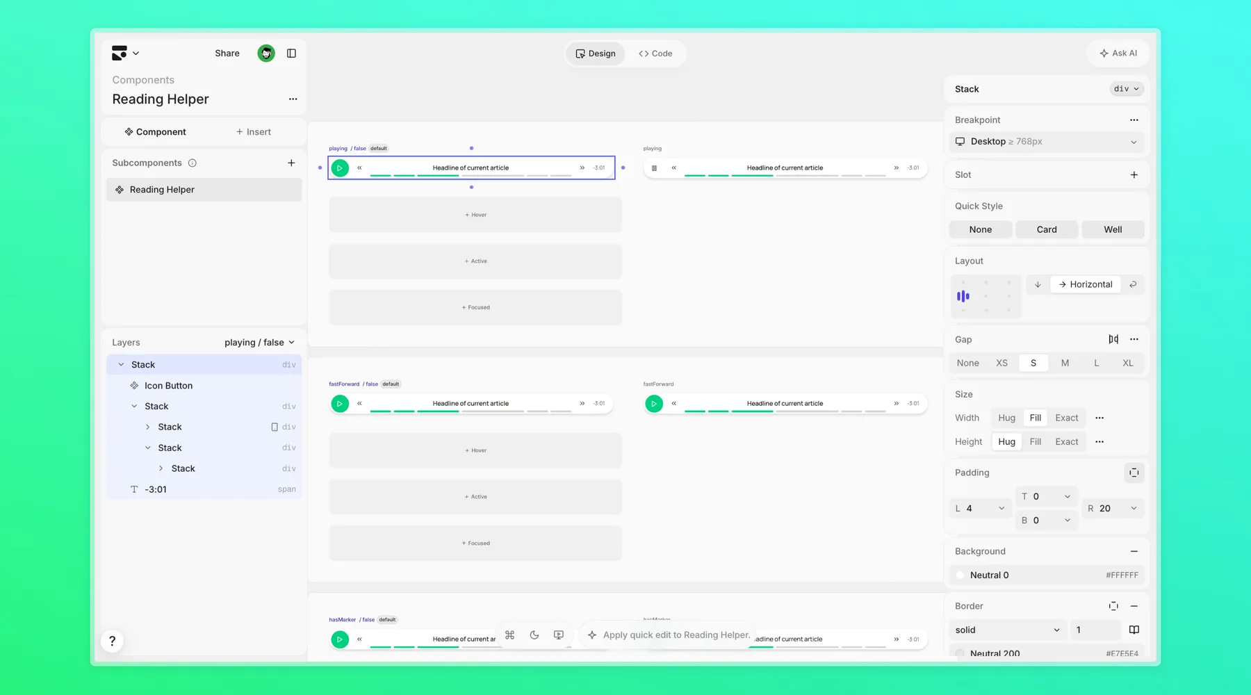
The site already had long-form case studies. The upgrade was to make the reading itself feel designed.
Role: Designer-engineer
Project: Personal portfolio reader system
Stack: Astro, MDX, React, Subframe, Web Speech API, CSS Custom Highlight API
Outcome
I rebuilt the portfolio’s reading helper from a passive progress widget into a small interaction layer for long articles and case studies: read-aloud controls, section progress, speed and voice selection, sentence-level highlighting, and lightweight reactions that pin to the thought a reader is responding to.
The important shift was not “add buttons.” It was changing the article from a static page into something a reader can control, skim, listen to, and mark up without leaving the page.
Listen without losing your place
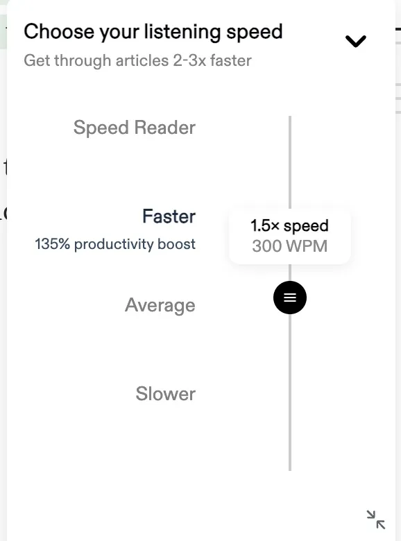
Press play to watch the mock reader advance through the story. The speed control restarts the current sentence, which mirrors the shipped speech API behavior.
The reader should feel like a companion, not another toolbar.
Speech starts with the headline, then moves sentence by sentence through the article.
Progress follows the structure of the story, so a reader can jump without losing their place.
The problem
The portfolio was asking readers to spend real time with dense project stories. That creates two different reader modes:
- Skimming for signal: hiring managers and peers need quick orientation before committing to the full read.
- Settling in: interested readers need help staying anchored once the article gets long.
The old helper was visually present, but it did not do enough work. It could not read the article aloud, could not follow the current sentence, and gave readers no way to react to a specific idea. The article was still a one-way document.
The new goal was sharper: build a companion for the page that helps a reader keep their place and leave a small mark at the exact moment something lands.
The design bet
The reader needed to stay compact. A big utility panel would compete with the story, especially on portfolio pages where the writing and screenshots are the product. So the interface borrows the language of a media control: a narrow pill, recognizable playback buttons, a segmented progress bar, and a reaction rail that only opens when needed.

The design had to answer a few questions:
| Reader need | Interface answer |
|---|---|
| “Where am I?” | Segmented progress mapped to article sections |
| “Can I listen instead?” | Text-to-speech that starts with the hero title and dek |
| “Can I control the pace?” | Persistent speed and voice controls |
| “What did I react to?” | Sentence-level pins and highlights |
| “Will this interrupt reading?” | Compact pill, minimal chrome, reactions tucked into a rail |
Building from the rendered article
I did not want every MDX file to maintain a second structured content model just so the reader could function. The component reads the rendered article DOM directly after hydration.
That gave the implementation three deliberate levels of granularity:
Blocks are headings, paragraphs, list items, and blockquotes. These are the units the speech engine reads aloud.
Sections are groups of blocks under H1/H2 headings. These become the progress scrubber segments, so progress reflects the shape of the story instead of one anonymous bar.
Sentences are addressed with DOM Ranges. These are where reactions attach, because a reaction belongs to the idea a reader is on, not the whole paragraph.
This kept authoring simple while still giving the client component enough structure to behave like a real reader.
Interaction details
Text-to-speech that feels intentional
The read-aloud feature uses the Web Speech API, but the design work is in the edges around it:
- It reads the hero title and description first, so the article starts naturally.
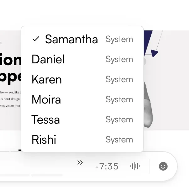
- It ranks available voices instead of blindly accepting a system default.
- It persists the chosen voice and speed locally.
- It restarts the current block when speed changes, because browser speech rate changes do not apply mid-utterance.
- It keeps long reads alive with a periodic pause/resume workaround for engines that drop speech queues.
Reactions that attach to sentences
The reaction system behaves more like Loom feedback than a generic emoji bar. When a reader reacts, the icon floats out of the control, the sentence is highlighted, and a small pin appears in the margin.
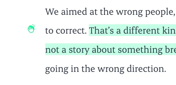
Under the hood, sentence placement uses a pragmatic rule: while speech is playing, pin the reaction to the sentence the speech boundary reports. When paused or idle, pin to the sentence nearest the reader’s on-screen reading line.
That tradeoff matters because browser speech support is uneven. Chrome and Firefox can report character boundaries; Safari can be quieter. The experience still works even when the browser provides less detail.
System decisions
Keep Subframe synced, own the behavior here
The visual language comes from the Subframe reading helper primitive, but the shipped behavior lives in the project-owned ReadingGuide.tsx. That boundary held even as the primitive grew: play icon, speed menu, and reactions rail are now real Subframe slots (playIcon, speedMenu, reactionsRail), each fed a fully interactive node — button, handler, and all — from the wrapper.
The scrubber stayed a harder case. Subframe components can’t loop over data or attach handlers to their own markup, so a real article’s variable-length sections and per-reaction timeline markers can never live inside a static six-segment demo track. Rather than force-fit the primitive or duplicate its chrome, the component now exposes one more seam — track plus useCustomTrack — that lets a consumer swap the entire scrubber region for its own data-driven markup while still sitting inside the synced pill, borders, and shadow. Composition over improvisation: extend the primitive with the seam it was missing, not code around it.
So the implementation composes Subframe pieces at two levels:
- The full
ReadingHelperroot for the pill chrome and the play/speed/reactions slots IconButton,Tooltip, and design tokens from Subframe inside the customtrack, for the parts that stay project-owned- Project-owned state for speech, progress, reactions, pin layout, and persistence
This kept the design language aligned without fighting the generated component.
Round-tripping the primitive mid-project
Adding those slots wasn’t a single sync — it took three small passes on the same Subframe component, each one closing a gap the previous pass exposed. The first pass added playIcon, speedMenu, reactionsRail, and a markers prop; syncing it down showed the markers had landed inside a hidden div, because Subframe can’t loop per-segment and had nowhere else to put an array-shaped prop. The second pass turned that into a positioned overlay a consumer could still drive. The third added the track escape hatch once it became clear the six-segment demo track could never host real per-article data.
Each pass was: describe the gap in Subframe, wait for the edit job, sync, then read the generated code back to check it actually did what was asked. That loop — design change, sync, verify against the real consumer — is what makes the Subframe boundary sustainable. Nothing about the reader’s behavior moved; only the seams available to plug it into got wider.
Use CSS highlights instead of rewriting content
Sentence reactions are painted through the CSS Custom Highlight API when available. That avoids wrapping text nodes with extra spans, which can break sentences that cross links, emphasis, or nested inline elements.
If the API is unavailable, the page falls back to tinting the whole block. Less precise, but still understandable and durable.
Store personal marks locally
Reactions are not public analytics. They are saved in localStorage per mode and slug, which makes them feel sticky to the reader without implying a backend feature that does not exist.
What changed
| Area | Before | After |
|---|---|---|
| Playback | No article-level read-aloud | Play, pause, previous/next section, speed, voice |
| Progress | Passive position indicator | Section-aware scrubber with active fill |
| Highlighting | No live sentence context | Current block highlight plus reacted sentence highlights |
| Feedback | No reader marks | Sentence-pinned reactions with floating acknowledgement |
| Article setup | Manual page assumptions | Reads hero + article DOM from a client island |
| Browser support | Basic happy path | Fallbacks for speech gaps, motion reduction, and missing Highlight API |
| Subframe boundary | Custom pill duplicating the primitive’s look | Play, speed, and reactions rendered through real ReadingHelper slots; only the data-driven scrubber stays project-owned via a track seam |
Impact
The upgrade makes the portfolio more useful for the exact kind of reading it asks for: long, evidence-heavy project narratives.
For quick scanners, the segmented scrubber exposes the shape of the page. For deep readers, read-aloud and live highlighting reduce the cost of staying with a long article. For interested readers, reactions create a small feedback loop without turning the case study into a comment thread.
The implementation also created reusable primitives for future article behavior: sentence range utilities, voice ranking, speech persistence, and article DOM collection can support other reader-focused features without changing how content is authored.
Reflection
This was a design-engineering problem more than a widget problem. The hard part was deciding what the article itself should understand about a reader’s state: current block, current section, current sentence, chosen voice, chosen speed, and personal reactions.
Once those states were named clearly, the interface got smaller. The controls did not need to explain themselves because they mapped to familiar media behavior. The page simply became more responsive to the person reading it.